• CSS-奇思妙想-全兼容的毛玻璃效果

    什么是 backdrop-filter

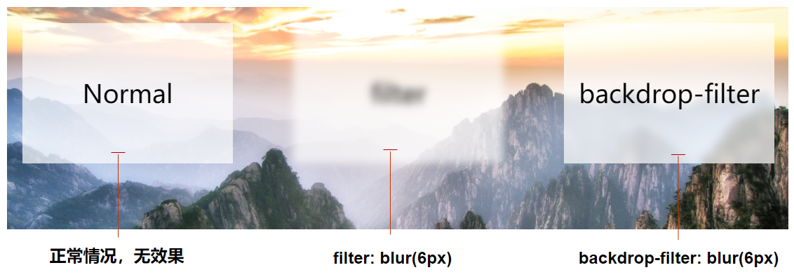
    backdrop-filter CSS 属性可以让你为一个元素后面区域添加图形效果(如模糊或颜色偏移)。 因为它适用于元素背后的所有元素,为了看到效果,必须使元素或其背景至少部分透明。

    backdrop-filterfilter 非常类似,可以取的值都是一样的,但是一个是作用于整个元素,一个是只作用于元素后面的区域。

    backdrop-filterfilter 对比

    我们使用 backdrop-filterfilter 同时实现一个毛玻璃效果作为对比,伪代码如下:

    1
    2
    3
    4
    5
    <div class="bg">
    <div>Normal</div>
    <div class="g-filter">filter</div>
    <div class="g-backdrop-filter">backdrop-filter</div>
    </div>
    1
    2
    3
    4
    5
    6
    7
    8
    9
    10
    11
    12
    13
    14
    15
    .bg {
    background: url(image.png);

    & > div {
    width: 300px;
    height: 200px;
    background: rgba(255, 255, 255, .7);
    }
    .g-filter {
    filter: blur(6px);
    }
    .g-backdrop-filter {
    backdrop-filter: blur(6px);
    }
    }

    CodePen Demo – filter 与 backdrop-filter 对比

    backdrop-filter 之前,想实现上述的只给元素背景添加滤镜效果还是非常困难的,并且,对于静态画面还好,如果背景还是可以滚动的动态背景,通常 CSS 是无能为力的。

    backdrop-filter 正是为了给元素后的内容添加滤镜而不影响元素本身而诞生的。使用它可以非常方便的实现磨砂玻璃效果(毛玻璃)!

    backdrop-filter 的兼容性

    backdrop-filter 其实已经诞生挺久了,然而,firefox 至今都不兼容它!

    对于部分已经放弃了 IE 的 PC 端业务而言,firefox 还是需要兼容的,想要让使用 backdrop-filter 实现毛玻璃效果应用落地,firefox 的兼容问题必须得解决。

    在 firefox 中实现毛玻璃效果

    OK,本文的重点就是在于如何在 firefox 中,不使用 backdrop-filter 而尽可能的还原毛玻璃的效果。

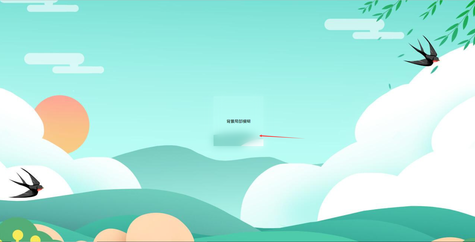
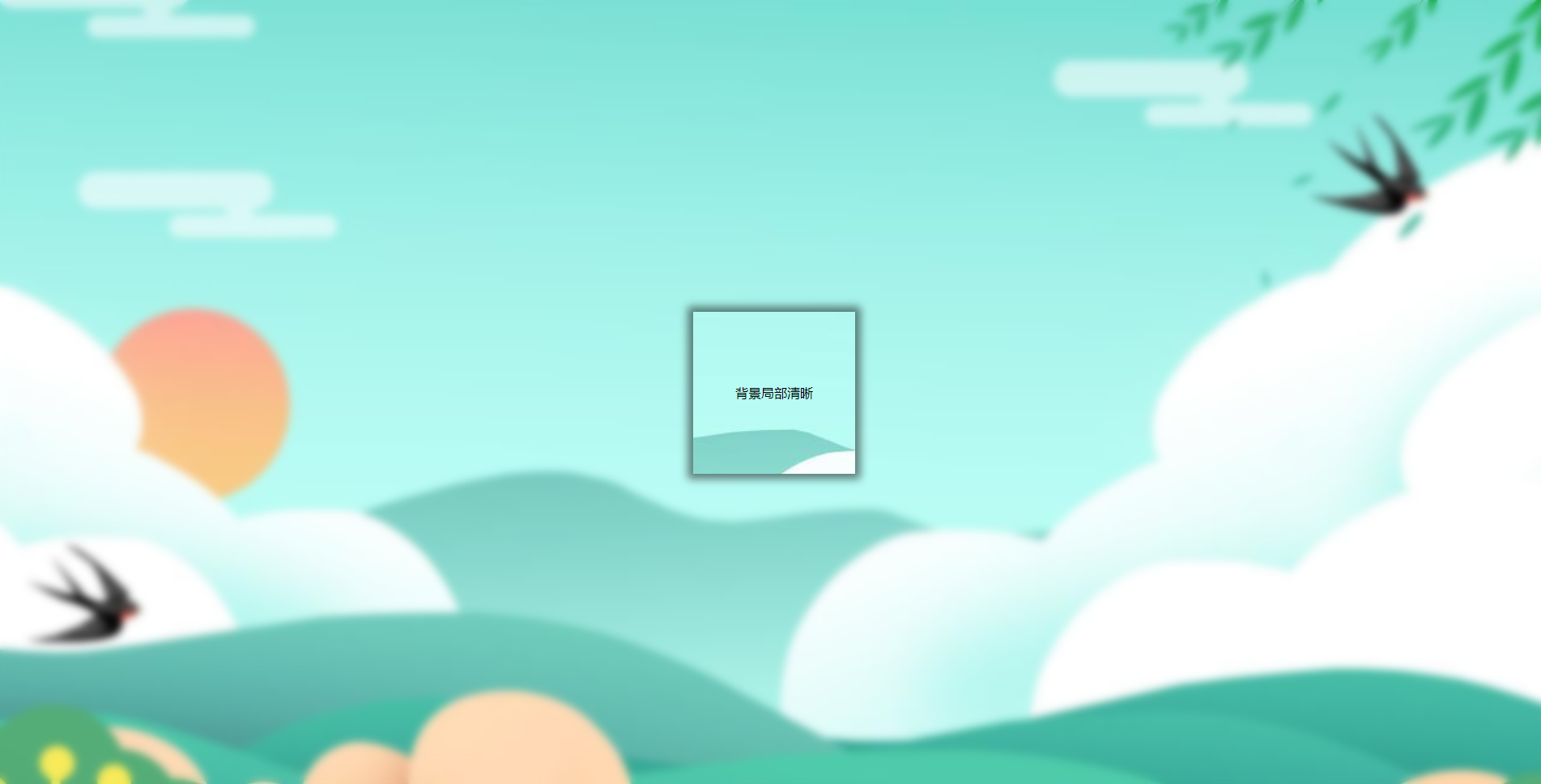
    首先看一下,如果是正常使用 backdrop-filter,还是上述的例子效果如下,是没有毛玻璃效果的:

    使用 background-attachment: fixed 兼容静态背景图

    如果在 firefox 上想使用毛玻璃效果。应用毛玻璃元素的背景只是一张静态背景图,其实方法是有很多的。

    我们只需在元素的背后,叠加一张同样的图片,利用 background-attachment: fixed 将叠加在元素下面的图片定位到与背景相同的坐标,再使用 filter: blur() 对其进行模糊处理即可。

    伪代码如下:

    1
    <div class="g-glossy">frosted glass effect </div>
    1
    2
    3
    4
    5
    6
    7
    8
    9
    10
    11
    12
    13
    14
    15
    16
    17
    18
    19
    20
    21
    22
    23
    24
    25
    26
    27
    28
    29
    30
    31
    32
    33
    34
    $img: 'https://static.pexels.com/photos/373934/pexels-photo-373934.jpeg';

    body {
    height: 100vh;
    display: flex;
    background-image: url($img);
    background-repeat: no-repeat;
    background-attachment: fixed;
    background-size: cover;
    }

    .g-glossy {
    position: relative;
    width: 600px;
    height: 300px;
    background-color: rgba(255, 255, 255, 0.5);
    overflow: hidden;
    z-index: 10;

    &::before {
    content: "";
    position: absolute;
    top: 0;
    left: 0;
    right: 0;
    bottom: 0;
    background-image: url($img);
    background-repeat: no-repeat;
    background-attachment: fixed;
    background-size: cover;
    filter: blur(10px);
    z-index: -1;
    }
    }

    效果如下:

    此方法也是在没有 backdrop-filter 之前,在各个浏览器想实现简单毛玻璃效果最常用的方法之一。

    CodePen Demo – 使用 background-attachment: fixed | filter: bulr() 实现毛玻璃效果

    使用 background-attachment: fixed 兼容静态背景图的缺点

    不过这种方法也有两个缺点:

    1. 由于使用了伪元素叠加了一层背景,因为层级关系,父元素的 background 是在最下层的,所以元素本身的背景色其实并没有被充分体现,可以对比下两种方法的实际效果图:

    解决方案是再通过另外一个伪元素再叠加一层背景色,这个背景色应该是原本赋值给父元素本身的。

    叠加之后的效果如下:

    CodePen Demo – 使用 background-attachment: fixed | filter: bulr() 实现毛玻璃效果优化

    1. 上述效果已经非常接近了,硬要挑刺的话,就是应用了模糊滤镜的伪元素的边缘有白边瑕疵,这一点其实是滤镜本身的问题,也非常好解决,我们只需要将伪元素的范围扩大一点即可:
    1
    2
    3
    4
    5
    6
    7
    8
    9
    10
    11
    12
    .g-glossy {
    overflow: hidden;
    ....
    &::before {
    content: "";
    position: absolute;
    top: -100px;
    left: -100px;
    right: -100px;
    bottom: -100px;
    }
    }

    定位的代码由 top: 0px; 改为 top: -100px,四个方位都是如此即可。如此一来,就能做到基本上是百分百的模拟。

    使用 moz-element() 配合 filter: blur() 实现复杂背景毛玻璃效果

    下面这种方法就非常巧妙了,正常而言,运用毛玻璃效果的背景元素,都不是一张图片那么简单!背后通常都是整个页面复杂的结构,多层 DOM 的嵌套。

    那么通过叠加一张简单的图片,就无法奏效了,我们得想办法模拟整个 DOM 元素。

    而恰好,在 Firefox 中,有这么一个属性 – -moz-element()

    何为 -moz-element()MDN-element 的解释是,CSS 函数 element() 定义了一个从任意的 HTML 元素中生成的图像 <image> 值。该图像值是实时的,这意味着如果被指定的 HTML 元素被更改,应用了该属性的元素的背景也会相应更改。

    它其实是个草案规范,但是一直以来,只有 Firefox 支持它 – CAN I USE – CSS element()

    它有什么作用呢?

    -moz-element() 如何使用

    那么 -moz-element() 如何使用呢?简而言之,它能够复制一个元素内部渲染出来的 UI,并且能够实时同步变化。

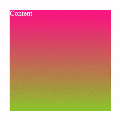
    假设我们有这样一个简单的结构,元素背景和内容都在运动:

    1
    2
    3
    <div id="bg" class="g-normal">
    <p>Content</p>
    </div>
    1
    2
    3
    4
    5
    6
    7
    8
    9
    10
    11
    12
    13
    14
    15
    16
    17
    18
    19
    20
    21
    22
    23
    24
    25
    26
    27
    28
    29
    .g-normal {
    margin: auto;
    width: 200px;
    height: 200px;
    animation: change 5s infinite;
    background: linear-gradient(deeppink, yellowgreen);
    }

    p {
    animation: move 5s infinite;
    }

    @keyframes change {
    0% {
    filter: hue-rotate(0);
    }
    100% {
    filter: hue-rotate(360deg);
    }
    }

    @keyframes move {
    0% {
    transform: translate(0, 0);
    }
    100% {
    transform: translate(150px, 150px);
    }
    }

    它的效果大概是这样:

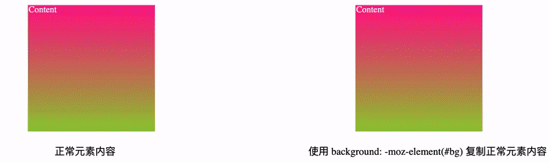
    我们就假设这个结构就是我们页面某一块的内容,然后,我们就可以使用 background: -moz-element(#id) 这种方式,将这个元素内绘制的 UI 内容完全拷贝至另外一个元素,看看效果。

    我们添加一个元素 <div class="g-element-copy"></div>,在这个元素内模拟 #bg 内的内容:

    1
    2
    3
    4
    <div id="bg" class="g-normal">
    <p>Content</p>
    </div>
    <div class="g-element-copy"></div>
    1
    2
    3
    4
    5
    6
    7
    .g-element-copy {
    margin: auto;
    width: 200px;
    height: 200px;
    // 核心代码
    background: -moz-element(#bg);
    }

    它可以完全复制另外一个元素内绘制出来的 UI,并且能追踪实时变化:

    CodePen Demo – -moz-element Demo(Firefox Only)

    在 firefox 中使用 element 复制 UI,用作毛玻璃元素背景

    这样,有了上面的铺垫,下面的内容就比较好理解了。

    和上述的 background-attachment: fixed 方案对比,我们还是通过伪元素叠加一层背景,只不过背景内的内容由单纯一张图片,变成了由 -moz-element() 复制的整段 UI 内容。

    其次,上面的方案我们使用 background-attachment: fixed 使背景图和伪元素内叠加的图片的位置对齐,在这里,我们需要借助 Javascript 进行简单的运算,确定背景内容元素的相关位置,计算对齐量。

    来看这样一个 DEMO:

    1
    2
    3
    4
    5
    6
    7
    8
    9
    10
    11
    12
    13
    <div id="bg" class="bg">
    <div>模拟真实 DOM</div>
    <div>模拟真实 DOM</div>
    <div>模拟真实 DOM</div>
    <div>模拟真实 DOM</div>
    <div>模拟真实 DOM</div>
    <div>模拟真实 DOM</div>
    <div>模拟真实 DOM</div>
    <div>模拟真实 DOM</div>
    <div>模拟真实 DOM</div>
    </div>
    <div class="g-glossy">frosted glass effect </div>
    <div class="g-glossy-firefox"></div>

    其中,.g-glossy 是在正常情况下 backdrop-filter 兼容时,我们的毛玻璃元素,而 .g-glossy-firefox 则是不兼容 backdrop-filter 时,我们需要模拟整个 DOM 背景 UI时候的元素,可以通过 CSS 特性检测 CSS @support 进行控制:

    核心 CSS 代码:

    1
    2
    3
    4
    5
    6
    7
    8
    9
    10
    11
    12
    13
    14
    15
    16
    17
    18
    19
    20
    21
    22
    23
    24
    25
    26
    .bg {
    // 整个页面的 DOM 结构
    }

    .g-glossy {
    position: fixed;
    width: 600px;
    height: 300px;
    background-color: rgba(255, 255, 255, 0.5);
    backdrop-filter: blur(10px);
    }

    .g-glossy-firefox {
    display: none;
    }

    @supports (background: -moz-element(#bg)) {
    .g-glossy-firefox {
    display: block;
    position: fixed;
    width: 600px;
    height: 300px;
    background: -moz-element(#bg) no-repeat;
    filter: blur(10px);
    }
    }

    简单解读一下:

    1. 对于兼容 backdrop-filter 的,.g-glossy 内的代码将直接生效,并且 .g-glossy-firefox 不会展示
    2. 对于 Firefox 浏览器,因为 backdrop-filter 必然不兼容,所以 .g-glossy 内的 backdrop-filter: blur(10px) 不会生效,而 @supports (background: -moz-element(#bg)) 内的样式会生效,此时 .g-glossy-firefox 将会利用 background: -moz-element(#bg) no-repeat; 模拟 id 为 bg 的元素

    当然,这里我们需要借助一定的 JavaScript 代码,计算我们的模拟页面 UI 的元素 .g-glossy-firefox 相对它模拟的 #bg 元素,也就是页面布局的一个定位偏差:

    1
    2
    3
    4
    5
    6
    7
    8
    9
    10
    11
    $(function() {
    let blur = $('.g-glossy-firefox')[0].style;
    let offset = $('.g-glossy').eq(0).offset();

    function updateBlur() {
    blur.backgroundPosition =
    `${-window.scrollX - offset.left}px ` +
    `${-window.scrollY - offset.top}px`;
    }
    document.addEventListener('scroll', updateBlur, false), updateBlur();
    });

    OK,至此,我们就能完美的在 Firefox 上也实现毛玻璃的效果了:

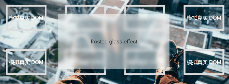
    它相对于上面的第一种方案而言,最大的不同之处在于,它可以模拟各式各样的背景元素,背景元素可以不仅仅只是一张图片!它可以是各种复杂的结构!

    这种方案是我的 CSS 群中,风海流 同学提供的一种思路,非常的巧妙,并且,他自己也对这种方案进行了完整的阐述,你可以戳这里看看:在网页中实现标题栏「毛玻璃」效果,本文也是经过他的同意,重新整理发出。

    上述效果的完整代码,你可以戳这里:

    CodePen Demo – 兼容 Firefox 的复杂背景毛玻璃(磨砂玻璃)效果

    总结一下

    简单对上述内容进行一个总结:

    • 你可以使用 backdrop-filter 对兼容它的浏览器非常简单的实现毛玻璃(磨砂玻璃)效果
    • 对于不兼容 backdrop-filter 的浏览器,如果它只是简单背景,可以使用 background-attachment: fixed 配合 filter: blur() 进行模拟
    • 对于 firefox 浏览器,你还可以使用 moz-element() 配合 filter: blur() 实现复杂背景毛玻璃效果
    • 对于不兼容的上述 3 种效果的其他浏览器,设置了毛玻璃效果的元素,可以通过设置类似 background: rgba(255, 255, 255, 0.5) 的样式,使之回退到半透明效果,也算一种非常合理的降级效果,不会引起 Bug
  • CSS_布局

    浮动布局

    float:left/right

    浮动布局会使浮动标签脱离文档流

    1. 宽度高度默认由内容决定
    2. 原先所在位置就会被其他块元素抢占
    3. 浮动元素在一行中依次排列,当一行无法容纳的时候会自动换行

    应用

    1. 全部浮动(超过两列)
    1
    2
    3
    4
    5
    6
    7
    8
    9
    10
    11
    ul>li{
    float:left;
    width:计算合适的宽度;
    }

    取消浮动(一般加在父元素上)
    ul::after{
    display:block; //设置为块元素
    content:""; //将内容设置为空值
    clear:both; //清除周边元素
    }
    1. 左侧浮动,右侧不浮动(两列)
    1
    2
    3
    4
    5
    6
    7
    8
    9
    10
    11
    12
    13
    14
    .content>.left{
    float:left;
    width:220px;
    }

    将另一个元素向右移230px
    .content>.right{
    margin-left:230px;
    }

    <div class="content">
    <div class="left"></div>
    <div class="right"></div>
    </div>

    对于导航类的布局一般浮动li
    该布局较难,多试验,多用就知道该如何使用

    定位布局

    作用

    当一个元素悬挂在其他元素之上,优先考虑定位布局
    eg: 模态框、下拉菜单、二级菜单、固定宣传栏、网页聊天页面

    用法

    position:static/relative/absolute/fixed

    static: 默认布局,默认文档流中,非定位元素

    relative: 定位元素(相对定位)

    1. 没有脱离文档流
    2. 参照点为当前元素原本位置

    absolute: 定位元素(绝对定位)

    1. 脱离了文档流
    2. 参照距离当前元素最近的父定位元素,如果所有的父元素都没有定位元素,参照浏览器视口

    fixed: 定位元素(固定定位)

    1. 脱离了文档流
    2. 参照浏览器视口

    sticky: 定位元素(粘滞定位)

    1. 不脱离文档流
    2. relative 和 fixed 的结合

    特点

    1. 可以使用描述当前元素位置的属性: top、right、bottom、left
    2. 可以使用z-index(向上浮动多少)
    3. 参照点(参照某个元素使用absolute、fixed、sticky)
    4. 是否脱离文档流

    伸缩盒布局

    作用

    使得子元素在父元素中分列显示,与float的作用类似。一般用于响应式布局(手机app中)

    用法

    1. 父元素在主轴上一定要有一个固定的宽/高
    2. 子元素在交叉轴上默认宽/高占满父元素
    3. 1
      2
      3
      4
      5
      6
      7
      8
      9
      <ul>
      <li></li>
      <li></li>
      <li></li>
      </ul>

      ul{
      display:flex;
      }

    ul伸缩盒

    1.设置父元素为伸缩盒(display: flex)

    2.主轴(flex-direction)

    1. 主轴:默认情况下为x轴
    2. 交叉轴默认情况下为y轴
    3. 元素沿着伸缩盒的主轴排列的

    3.伸缩盒自动换行(flex-wrap)

    1. nowrap: 默认值,不换行
    2. wrap: 换行

    li伸缩盒的元素

    1. 基础值: flex-basis(主轴上元素的基础值)
    2. 对盈余空间的分配: flex-grow
    3. 对亏损空间的贡献: flex-shrink

    速写: flex: grow shrink basis;

    例子

    布局代码

    1
    2
    3
    4
    5
    6
    7
    8
    9
    10
    11
    12
    13
    14
    15
    16
    17
    18
    19
    20
    21
    22
    23
    24
    25
    26
    27
    28
    29
    30
    31
    32
    33
    34
    35
    36
    37
    38
    39
    40
    41
    42
    43
    44
    45
    46
    47
    48
    49
    50
    51
    52
    53
    54
    55
    56
    57
    58
    59
    60
    61
    62
    63
    64
    65
    66
    67
    68
    69
    70
    71
    72
    73
    74
    75
    76
    77
    78
    79
    80
    81
    82
    83
    84
    85
    86
    87
    88
    89
    90
    91
    92
    93
    94
    95
    96
    97
    98
    99
    100
    101
    102
    103
    104
    105
    106
    107
    108
    <!DOCTYPE html>
    <html lang="en">
    <head>
    <meta charset="UTF-8">
    <title>Document</title>
    <link rel="stylesheet" href="./test2.css">
    </head>
    <body>
    <div class="container">
    <!-- 导航布局开始 -->
    <div class="wrapper">
    <div class="nav">
    <ul class="ul">
    <li>
    <a href="#">美食</a>
    <div>美食子元素</div>
    </li>
    <li>
    <a href="#">旅行</a>
    <div>旅行子元素</div>
    </li>
    <li>
    <a href="#">阅读</a>
    <div>阅读子元素</div>
    </li>
    <li>
    <a href="#">服饰</a>
    <div>服饰子元素</div>
    </li>
    <li>
    <a href="#">装饰</a>
    <div>装饰子元素</div>
    </li>
    <li>
    <a href="#">数码</a>
    <div>数码子元素</div>
    </li>
    <li>
    <a href="#">家电</a>
    <div>家电子元素</div>
    </li>
    </ul>
    </div>
    </div>
    </div>
    <!-- 导航布局结束 -->

    <!-- 左fixed布局开始 -->
    <div class="left">
    <ul>
    <li>
    <a href="#">数码</a>
    <div>数码子元素</div>
    </li>

    <li>
    <a href="#">旅行</a>
    <div>旅行子元素</div>
    </li>

    <li>
    <a href="#">阅读</a>
    <div>阅读子元素</div>
    </li>

    <li>
    <a href="#">装饰</a>
    <div>装饰子元素</div>
    </li>

    <li>
    <a href="#">家电</a>
    <div>家电子元素</div>
    </li>
    </ul>
    </div>
    <!-- 左fixed布局结束 -->

    <!-- 右sticky布局开始 -->
    <div class="right">
    <ul>
    <li>
    <a href="#">数码</a>
    <div>数码子元素</div>
    </li>

    <li>
    <a href="#">旅行</a>
    <div>旅行子元素</div>
    </li>

    <li>
    <a href="#">阅读</a>
    <div>阅读子元素</div>
    </li>

    <li>
    <a href="#">装饰</a>
    <div>装饰子元素</div>
    </li>

    <li>
    <a href="#">家电</a>
    <div>家电子元素</div>
    </li>
    </ul>
    </div>
    <!-- 右sticky布局结束 -->

    样式代码

    1
    2
    3
    4
    5
    6
    7
    8
    9
    10
    11
    12
    13
    14
    15
    16
    17
    18
    19
    20
    21
    22
    23
    24
    25
    26
    27
    28
    29
    30
    31
    32
    33
    34
    35
    36
    37
    38
    39
    40
    41
    42
    43
    44
    45
    46
    47
    48
    49
    50
    51
    52
    53
    54
    55
    56
    57
    58
    59
    60
    61
    62
    63
    64
    65
    66
    67
    68
    69
    70
    71
    72
    73
    74
    75
    76
    77
    78
    79
    80
    81
    82
    83
    84
    85
    86
    87
    88
    89
    90
    91
    92
    93
    94
    95
    96
    97
    98
    99
    100
    101
    102
    103
    104
    105
    106
    107
    108
    109
    110
    111
    112
    113
    114
    115
    116
    117
    118
    119
    120
    121
    122
    123
    124
    125
    126
    127
    128
    129
    130
    131
    132
    133
    134
    135
    136
    137
    138
    139
    140
    141
    142
    143
    144
    145
    146
    147
    148
    149
    150
    151
    152
    153
    154
    155
    156
    157
    158
    159
    160
    161
    162
    163
    164
    165
    166
    /*导航样式开始*/
    /*重置样式*/
    *{
    padding: 0;
    margin: 0;
    list-style: none;
    }

    body{
    margin: 0;
    padding: 0;
    }

    ul{
    list-style: none;
    margin: 0;
    padding: 0;
    }

    .wrapper{
    margin: 0 auto;
    width: 1200px;
    }

    /*重置a的样式*/
    .container > .wrapper > .nav > ul a{
    text-decoration-line: none;
    color: #333;
    }

    /*设置.container背景*/
    .container{
    background-color: lightblue;
    line-height: 3em;
    }

    /*将ul设置为伸缩盒*/
    .container .nav > ul{
    display: flex;
    position: relative;
    }

    /*将ul中的li分配空间*/
    .container .nav > ul > li{
    flex-grow: 1;
    text-align: center;
    }

    /*将ul设置为相对布局*/
    .container .ul{
    position: relative;
    }

    /*设置div的属性,隐藏*/
    .container .ul > li > div{
    position: absolute;
    left: 0;
    top: 100%;
    width:100%;
    background-color: teal;
    height: 200px;
    line-height: 200px;
    display: none;
    }

    .container .ul > li:hover > div{
    display: block;
    }
    /*导航样式结束*/


    /*左fixed样式开始*/

    /*重置a标签样式*/
    .left > ul > li a{
    text-decoration-line: none;
    color: #333;
    }

    /*将整个left.div设置为fixed布局*/
    .left{
    position: fixed;
    left: 0;
    top: 200px;
    width: 100px;
    background-color: pink;
    }

    /*设置li的格式*/
    .left > ul > li{
    height: 100px;
    line-height: 100px;
    border-bottom: 1px solid #fff;
    position: relative;
    text-align: center;
    }

    /*设置子元素格式*/
    .left > ul > li > div{
    display: block;
    position: absolute;
    left: 100%;
    top: 0;
    width: 300px;
    background-color: teal;
    height: 300px;
    display: none;
    }

    /*将光标移动到li将div显示*/
    .left > ul > li:hover > div{
    display: block;
    }

    /*左fixed样式结束 */


    /*右sticky样式开始*/

    /*重置a标签的样式*/
    .right > ul > li a{
    text-decoration-line: none;
    color: #333;
    }

    /*将right设置为sticky布局,且浮动到右边*/
    .right{
    position: sticky;
    float: right;
    width: 100px;
    background-color: pink;
    top: 200px;
    }

    /*将li设置为相对布局*/
    .right > ul > li{
    text-align: center;
    height: 100px;
    line-height: 100px;
    border-bottom: 1px solid #fff;
    position: relative;
    }

    /*将div设置为绝对布局,且向右移动整个父元素的宽度*/
    .right > ul > li > div{
    position: absolute;
    right: 100%;
    background-color: teal;
    width: 200px;
    top: 0;
    display: none;
    }

    /*将div显示*/
    .right > ul > li:hover > div{
    display: block;
    }


    /*右sticky样式结束*/

    成型模样

    image

  • css3实现背景模糊的三种方式

    一、普通背景模糊

    代码:

    1
    2
    3
    4
    5
    6
    7
    8
    9
    10
    11
    12
    13
    14
    15
    16
    17
    18
    19
    20
    21
    22
    23
    24
    25
    26
    27
    28
    29
    30
    31
    32
    33
    34
    35
    36
    37
    38
    39
    40
    41
    42
    43
    <head>
    <Style>
    html,
    body {
    width: 100%;
    height: 100%;
    }

    * {
    margin: 0;
    padding: 0;
    }

    /*背景模糊*/
    .bg {
    width: 100%;
    height: 100%;
    position: relative;
    background: url("./bg.jpg") no-repeat fixed;
    background-size: cover;
    box-sizing: border-box;
    filter: blur(2px);
    z-index: 1;
    }

    .content {
    position: absolute;
    left: 50%;
    top: 50%;
    transform: translate(-50%, -50%);
    width: 200px;
    height: 200px;
    text-align: center;
    z-index: 2;
    }
    </Style>
    </head>

    <body>
    <div class="bg">
    <div class="content">背景模糊</div>
    </div>
    </body>

    效果如下所示:

    这样写会使整个div的后代模糊并且还会出现白边,导致页面非常不美观,要想解决这个问题,我们可以使用伪元素,因为伪元素的模糊度不会被父元素的子代继承。

    代码:

    1
    2
    3
    4
    5
    6
    7
    8
    9
    10
    11
    12
    13
    14
    15
    16
    17
    18
    19
    20
    21
    22
    23
    24
    25
    26
    27
    28
    29
    30
    31
    32
    33
    34
    35
    36
    37
    38
    39
    40
    41
    42
    43
    44
    45
    46
    47
    48
    49
    50
    51
    52
    53
    54
    55
    56
    <head>
    <Style>
    html,
    body {
    width: 100%;
    height: 100%;
    }

    * {
    margin: 0;
    padding: 0;
    }

    /*背景模糊*/
    .bg {
    width: 100%;
    height: 100%;
    position: relative;
    background: url("./bg.jpg") no-repeat fixed;
    background-size: cover;
    box-sizing: border-box;
    z-index: 1;
    }

    .bg:after {
    content: "";
    width: 100%;
    height: 100%;
    position: absolute;
    left: 0;
    top: 0;
    /* 从父元素继承 background 属性的设置 */
    background: inherit;
    filter: blur(2px);
    z-index: 2;
    }


    .content {
    position: absolute;
    left: 50%;
    top: 50%;
    transform: translate(-50%, -50%);
    width: 200px;
    height: 200px;
    text-align: center;
    z-index: 3;
    }
    </Style>
    </head>

    <body>
    <div class="bg">
    <div class="content">背景模糊</div>
    </div>
    </body>

    效果如下所示:

    二、背景局部模糊

    上一个效果会了之后,局部模糊效果就比较简单了。

    代码:

    1
    2
    3
    4
    5
    6
    7
    8
    9
    10
    11
    12
    13
    14
    15
    16
    17
    18
    19
    20
    21
    22
    23
    24
    25
    26
    27
    28
    29
    30
    31
    32
    33
    34
    35
    36
    37
    38
    39
    40
    41
    42
    43
    44
    45
    46
    47
    48
    49
    50
    51
    52
    53
    54
    55
    56
    57
    58
    59
    60
    61
    62
    63
    64
    65
    66
    67
    68
    <head>
    <Style>
    html,
    body {
    width: 100%;
    height: 100%;
    }

    * {
    margin: 0;
    padding: 0;
    }

    /*背景模糊*/
    .bg {
    width: 100%;
    height: 100%;
    position: relative;
    background: url("./bg.jpg") no-repeat fixed;
    background-size: cover;
    box-sizing: border-box;
    z-index: 1;
    }

    .content {
    position: absolute;
    left: 50%;
    top: 50%;
    transform: translate(-50%, -50%);
    width: 200px;
    height: 200px;
    background: inherit;
    z-index: 2;
    }

    .content:after {
    content: "";
    width: 100%;
    height: 100%;
    position: absolute;
    left: 0;
    top: 0;
    background: inherit;
    filter: blur(15px);
    /*为了模糊更明显,调高模糊度*/
    z-index: 3;
    }

    .content>div {
    width: 100%;
    height: 100%;
    text-align: center;
    line-height: 200px;
    position: absolute;
    left: 0;
    top: 0;
    z-index: 4;
    }
    </Style>
    </head>

    <body>
    <div class="bg">
    <div class="content">
    <div>背景局部模糊</div>
    </div>
    </div>
    </body>

    效果如下图所示:

    三、背景局部清晰

    代码:

    1
    2
    3
    4
    5
    6
    7
    8
    9
    10
    11
    12
    13
    14
    15
    16
    17
    18
    19
    20
    21
    22
    23
    24
    25
    26
    27
    28
    29
    30
    31
    32
    33
    34
    35
    36
    37
    38
    39
    40
    41
    42
    43
    44
    45
    46
    47
    48
    49
    50
    51
    52
    53
    54
    55
    56
    57
    58
    <head>
    <Style>
    html,
    body {
    width: 100%;
    height: 100%;
    }

    * {
    margin: 0;
    padding: 0;
    }

    /*背景模糊*/
    .bg {
    width: 100%;
    height: 100%;
    position: relative;
    background: url("./bg.jpg") no-repeat fixed;
    background-size: cover;
    box-sizing: border-box;
    z-index: 1;
    }

    .bg:after {
    content: "";
    width: 100%;
    height: 100%;
    position: absolute;
    left: 0;
    top: 0;
    background: inherit;
    filter: blur(5px);
    z-index: 2;
    }

    .content {
    position: absolute;
    left: 50%;
    top: 50%;
    transform: translate(-50%, -50%);
    width: 200px;
    line-height: 200px;
    text-align: center;
    background: inherit;
    z-index: 3;
    box-shadow: 0 0 10px 6px rgba(0, 0, 0, .5);
    }
    </Style>
    </head>

    <body>
    <div class="bg">
    <div class="content">
    <div>背景局部清晰</div>
    </div>
    </div>
    </body>

    效果如下图所示:

  • 移动端适配

    1
    2
    3
    4
    5
    6
    7
    8
    9
    10
    11
    12
    13
    14
    15
    16
    17
    18
    19
    20
    21
    22
    23
    24
    25
    26
    27
    28
    29
    yarn add postcss-px-to-viewport -D

    // 添加.postcssrc.js文件

    const path = require('path');

    module.exports = ({ webpack }) => {
    const designWidth = webpack.resourcePath.includes(path.join('node_modules', 'vant')) ? 375 : 750;

    return {
    plugins: {
    autoprefixer: {},
    "postcss-px-to-viewport": {
    unitToConvert: "px",
    viewportWidth: designWidth,
    unitPrecision: 6,
    propList: ["*"],
    viewportUnit: "vw",
    fontViewportUnit: "vw",
    selectorBlackList: [],
    minPixelValue: 1,
    mediaQuery: true,
    exclude: [],
    landscape: false
    }
    }
    }

    }
  • JSON动画渲染成图片

    1
    2
    3
    4
    5
    6
    7
    8
    9
    10
    11
    12
    // 安装依赖
    yarn add 'lottie-web'

    // 使用
    import lottie from 'lottie-web'
    lottie.loadAnimation({
    container: <DOCUMENT节点>,
    renderer: 'svg',
    loop: true,
    autoplay: true,
    animationData: <JSON文件>
    })
  • 动态加载路由

    1
    2
    3
    4
    5
    6
    7
    8
    9
    10
    11
    12
    13
    14
    15
    16
    17
    18
    // vue-cli
    export const loadView = (view: unknown) => {
    return () => import(`@/views/${view}.vue`)
    }

    // vite
    const modules = import.meta.glob('../views/**/*.vue')

    export const loadView = (view: any) => {
    let res
    for (const path in modules) {
    const dir = path.split('views/')[1].split('.vue')[0]
    if (dir === view) {
    res = () => modules[path]()
    }
    }
    return res
    }
  • unplugin-icons配置

    1
    2
    3
    4
    5
    6
    7
    8
    9
    10
    11
    12
    13
    14
    15
    16
    17
    18
    19
    20
    21
    22
    // 安装配置
    yarn add unplugin-icons @iconify/json -D

    // vite.config.ts
    import Icons from 'unplugin-icons/vite'
    import IconsResolver from 'unplugin-icons/resolver'
    import Components from 'unplugin-vue-components/vite'

    export default {
    plugins: [
    Components({
    resolvers: IconsResolver()
    }),
    Icons({
    compiler: 'vue3',
    autoInstall: true,
    })
    ]
    }

    // 使用示例
    // 我们先打开网址:icones.netlify.app/ 随便选择一个图标
  • vite权限路由

    1
    2
    3
    4
    5
    6
    7
    8
    9
    10
    11
    12
    13
    14
    15
    16
    17
    18
    19
    20
    21
    22
    23
    24
    25
    26
    27
    28
    29
    30
    31
    32
    33
    34
    35
    36
    37
    38
    39
    40
    41
    42
    43
    44
    45
    46
    47
    48
    49
    50
    51
    52
    53
    54
    55
    56
    57
    58
    59
    60
    61
    62
    63
    64
    65
    66
    67
    68
    69
    70
    71
    72
    73
    74
    75
    76
    77
    78
    79
    80
    81
    82
    83
    84
    85
    86
    87
    88
    89
    90
    91
    92
    93
    94
    95
    96
    97
    98
    99
    100
    101
    102
    103
    104
    105
    106
    107
    108
    109
    110
    111
    112
    113
    114
    115
    116
    117
    118
    119
    120
    121
    122
    123
    import { constantRoutes } from '@/router'
    import { getRouters } from '@/api/menu'
    import Layout from '@/layout/index.vue'
    import ParentView from '@/components/ParentView/index.vue'
    import { defineStore } from 'pinia'

    // 匹配views里面所有的.vue文件
    const modules = import.meta.glob('../views/**/*.vue')

    /**
    * TODO: 之后把any替换为对应的interface
    * */

    export const usePermissionStore = defineStore({
    id: 'permission',
    state: () => {
    return {
    routes: [],
    addRoutes: [],
    defaultRoutes: [],
    topbarRouters: [],
    sidebarRouters: []
    }
    },
    actions: {
    setRoutes(routes: any) {
    this.addRoutes = routes
    this.routes = constantRoutes.concat(routes) as any
    },
    setDefaultRoutes(routes: any) {
    this.defaultRoutes = constantRoutes.concat(routes) as any
    },
    setTopbarRoutes(routes: any) {
    this.topbarRouters = routes
    },
    setSidebarRouters(routes: any) {
    this.sidebarRouters = routes
    },
    generateRoutes() {
    return new Promise((resolve) => {
    // 向后端请求路由数据
    getRouters().then((res) => {
    const sdata = JSON.parse(JSON.stringify(res.data))
    const rdata = JSON.parse(JSON.stringify(res.data))
    const defaultData = JSON.parse(JSON.stringify(res.data))
    const sidebarRoutes = filterAsyncRouter(sdata)
    const rewriteRoutes = filterAsyncRouter(rdata, false, true)
    const defaultRoutes = filterAsyncRouter(defaultData)
    this.setRoutes(rewriteRoutes)
    this.setSidebarRouters(constantRoutes.concat(sidebarRoutes))
    this.setDefaultRoutes(sidebarRoutes)
    this.setTopbarRoutes(defaultRoutes)
    resolve(rewriteRoutes)
    })
    })
    }
    }
    })

    // 遍历后台传来的路由字符串,转换为组件对象
    function filterAsyncRouter(
    asyncRouterMap: any,
    lastRouter = false,
    type = false
    ) {
    return asyncRouterMap.filter((route: any) => {
    if (type && route.children) {
    route.children = filterChildren(route.children)
    }
    if (route.component) {
    // Layout ParentView 组件特殊处理
    if (route.component === 'Layout') {
    route.component = Layout
    } else if (route.component === 'ParentView') {
    route.component = ParentView
    } else {
    route.component = loadView(route.component)
    }
    }
    if (route.children != null && route.children && route.children.length) {
    route.children = filterAsyncRouter(route.children, route, type)
    } else {
    delete route.children
    delete route.redirect
    }
    return true
    })
    }

    function filterChildren(childrenMap: any, lastRouter: any = false) {
    let children: any = []
    childrenMap.forEach((el: any, index: number) => {
    if (el.children && el.children.length) {
    if (el.component === 'ParentView' && !lastRouter) {
    el.children.forEach((c: any) => {
    c.path = el.path + '/' + c.path
    if (c.children && c.children.length) {
    children = children.concat(filterChildren(c.children, c))
    return
    }
    children.push(c)
    })
    return
    }
    }
    if (lastRouter) {
    el.path = lastRouter.path + '/' + el.path
    }
    children = children.concat(el)
    })
    return children
    }

    export const loadView = (view: any) => {
    let res
    for (const path in modules) {
    const dir = path.split('views/')[1].split('.vue')[0]
    if (dir === view) {
    res = () => modules[path]()
    }
    }
    return res
    }
  • eslint.js通用配置

    1
    2
    3
    4
    5
    6
    7
    8
    9
    10
    11
    12
    13
    14
    15
    16
    17
    18
    19
    20
    21
    22
    23
    24
    25
    26
    27
    28
    29
    30
    31
    32
    33
    34
    35
    36
    37
    38
    39
    40
    41
    42
    43
    44
    45
    46
    47
    48
    49
    50
    51
    52
    53
    54
    55
    56
    57
    58
    59
    60
    61
    62
    63
    64
    65
    66
    67
    68
    69
    70
    71
    72
    73
    74
    75
    76
    77
    78
    79
    80
    81
    82
    83
    84
    85
    86
    87
    88
    89
    90
    91
    92
    93
    94
    95
    96
    97
    98
    99
    100
    101
    102
    103
    104
    105
    106
    107
    108
    109
    110
    111
    112
    113
    114
    115
    116
    117
    118
    119
    120
    121
    122
    123
    124
    125
    126
    127
    128
    129
    130
    131
    132
    133
    134
    135
    136
    137
    138
    139
    140
    141
    142
    143
    144
    145
    146
    147
    148
    149
    150
    151
    152
    153
    154
    155
    156
    module.exports = {
    root: true,
    env: {
    browser: true,
    node: true,
    es2021: true,
    },
    parser: 'vue-eslint-parser',
    extends: [
    'eslint:recommended',
    'plugin:vue/vue3-recommended',
    'plugin:@typescript-eslint/recommended',
    'plugin:prettier/recommended',
    // eslint-config-prettier 的缩写
    'prettier',
    ],
    parserOptions: {
    ecmaVersion: 12,
    parser: '@typescript-eslint/parser',
    sourceType: 'module',
    ecmaFeatures: {
    jsx: true,
    },
    },
    // eslint-plugin-vue @typescript-eslint/eslint-plugin eslint-plugin-prettier的缩写
    plugins: ['vue', '@typescript-eslint', 'prettier'],
    rules: {
    '@typescript-eslint/ban-ts-ignore': 'off',
    '@typescript-eslint/no-unused-vars': 'off',
    '@typescript-eslint/explicit-function-return-type': 'off',
    '@typescript-eslint/no-explicit-any': 'off',
    '@typescript-eslint/no-var-requires': 'off',
    '@typescript-eslint/no-empty-function': 'off',
    '@typescript-eslint/no-use-before-define': 'off',
    '@typescript-eslint/ban-ts-comment': 'off',
    '@typescript-eslint/ban-types': 'off',
    '@typescript-eslint/no-non-null-assertion': 'off',
    '@typescript-eslint/explicit-module-boundary-types': 'off',
    'no-var': 'error',
    'prettier/prettier': 'error',
    // 禁止出现console
    'no-console': 'warn',
    // 禁用debugger
    'no-debugger': 'warn',
    // 禁止出现重复的 case 标签
    'no-duplicate-case': 'warn',
    // 禁止出现空语句块
    'no-empty': 'warn',
    // 禁止不必要的括号
    'no-extra-parens': 'off',
    // 禁止对 function 声明重新赋值
    'no-func-assign': 'warn',
    // 禁止在 return、throw、continue 和 break 语句之后出现不可达代码
    'no-unreachable': 'warn',
    // 强制所有控制语句使用一致的括号风格
    curly: 'warn',
    // 要求 switch 语句中有 default 分支
    'default-case': 'warn',
    // 强制尽可能地使用点号
    'dot-notation': 'warn',
    // 要求使用 === 和 !==
    eqeqeq: 'warn',
    // 禁止 if 语句中 return 语句之后有 else 块
    'no-else-return': 'warn',
    // 禁止出现空函数
    'no-empty-function': 'warn',
    // 禁用不必要的嵌套块
    'no-lone-blocks': 'warn',
    // 禁止使用多个空格
    'no-multi-spaces': 'warn',
    // 禁止多次声明同一变量
    'no-redeclare': 'warn',
    // 禁止在 return 语句中使用赋值语句
    'no-return-assign': 'warn',
    // 禁用不必要的 return await
    'no-return-await': 'warn',
    // 禁止自我赋值
    'no-self-assign': 'warn',
    // 禁止自身比较
    'no-self-compare': 'warn',
    // 禁止不必要的 catch 子句
    'no-useless-catch': 'warn',
    // 禁止多余的 return 语句
    'no-useless-return': 'warn',
    // 禁止变量声明与外层作用域的变量同名
    'no-shadow': 'off',
    // 允许delete变量
    'no-delete-var': 'off',
    // 强制数组方括号中使用一致的空格
    'array-bracket-spacing': 'warn',
    // 强制在代码块中使用一致的大括号风格
    'brace-style': 'warn',
    // 强制使用骆驼拼写法命名约定
    camelcase: 'warn',
    // 强制使用一致的缩进
    indent: 'off',
    // 强制在 JSX 属性中一致地使用双引号或单引号
    // 'jsx-quotes': 'warn',
    // 强制可嵌套的块的最大深度4
    'max-depth': 'warn',
    // 强制最大行数 300
    // "max-lines": ["warn", { "max": 1200 }],
    // 强制函数最大代码行数 50
    // 'max-lines-per-function': ['warn', { max: 70 }],
    // 强制函数块最多允许的的语句数量20
    'max-statements': ['warn', 100],
    // 强制回调函数最大嵌套深度
    'max-nested-callbacks': ['warn', 3],
    // 强制函数定义中最多允许的参数数量
    'max-params': ['warn', 3],
    // 强制每一行中所允许的最大语句数量
    'max-statements-per-line': ['warn', { max: 1 }],
    // 要求方法链中每个调用都有一个换行符
    'newline-per-chained-call': ['warn', { ignoreChainWithDepth: 3 }],
    // 禁止 if 作为唯一的语句出现在 else 语句中
    'no-lonely-if': 'warn',
    // 禁止空格和 tab 的混合缩进
    'no-mixed-spaces-and-tabs': 'warn',
    // 禁止出现多行空行
    'no-multiple-empty-lines': 'warn',
    // 禁止出现;
    semi: ['warn', 'never'],
    // 强制在块之前使用一致的空格
    'space-before-blocks': 'warn',
    // 强制在 function的左括号之前使用一致的空格
    // 'space-before-function-paren': ['warn', 'never'],
    // 强制在圆括号内使用一致的空格
    'space-in-parens': 'warn',
    // 要求操作符周围有空格
    'space-infix-ops': 'warn',
    // 强制在一元操作符前后使用一致的空格
    'space-unary-ops': 'warn',
    // 强制在注释中 // 或 /* 使用一致的空格
    // "spaced-comment": "warn",
    // 强制在 switch 的冒号左右有空格
    'switch-colon-spacing': 'warn',
    // 强制箭头函数的箭头前后使用一致的空格
    'arrow-spacing': 'warn',
    'no-var': 'warn',
    'prefer-const': 'warn',
    'prefer-rest-params': 'warn',
    'no-useless-escape': 'warn',
    'no-irregular-whitespace': 'warn',
    'no-prototype-builtins': 'warn',
    'no-fallthrough': 'warn',
    'no-extra-boolean-cast': 'warn',
    'no-case-declarations': 'warn',
    'no-async-promise-executor': 'warn',
    },
    globals: {
    defineProps: 'readonly',
    defineEmits: 'readonly',
    defineExpose: 'readonly',
    withDefaults: 'readonly',
    },
    }
  • prettier.js通用配置

    1
    2
    3
    4
    5
    6
    7
    8
    9
    10
    11
    12
    13
    14
    15
    16
    17
    18
    19
    {
    "printWidth": 80,
    "tabWidth": 2,
    "useTabs": false,
    "semi": false,
    "singleQuote": true,
    "quoteProps": "as-needed",
    "bracketSpacing": true,
    "trailingComma": "none",
    "jsxBracketSameLine": false,
    "jsxSingleQuote": false,
    "arrowParens": "always",
    "insertPragma": false,
    "requirePragma": false,
    "proseWrap": "never",
    "htmlWhitespaceSensitivity": "strict",
    "endOfLine": "auto",
    "rangeStart": 0
    }